Over the past few weeks, I used Claude Code to rebuild large parts of my portfolio; faster than I expected, but not without things breaking in ways I didn’t anticipate. I want to write about what that experience was actually like, not the marketing version, but the honest one, including the things that broke, the bugs that took multiple attempts to fix, and the features that turned out better than I expected.
What is Claude Code?
Claude Code is Anthropic's AI coding tool that runs directly in your terminal. Unlike a chat interface where you paste code back and forth, it has direct access to your file system and can read your entire codebase, make edits, run commands, and work across multiple files at once. I used the Visual Studio Code extension which made it easy to use alongside my editor.
The biggest difference from something like ChatGPT is that Claude Code already knows your project. It can see my file structure, the libraries I have installed, the CSS conventions I follow, and how my components connect to each other. I do not have to re-explain any of that every time I ask something.
What I Built
Site-Wide Search
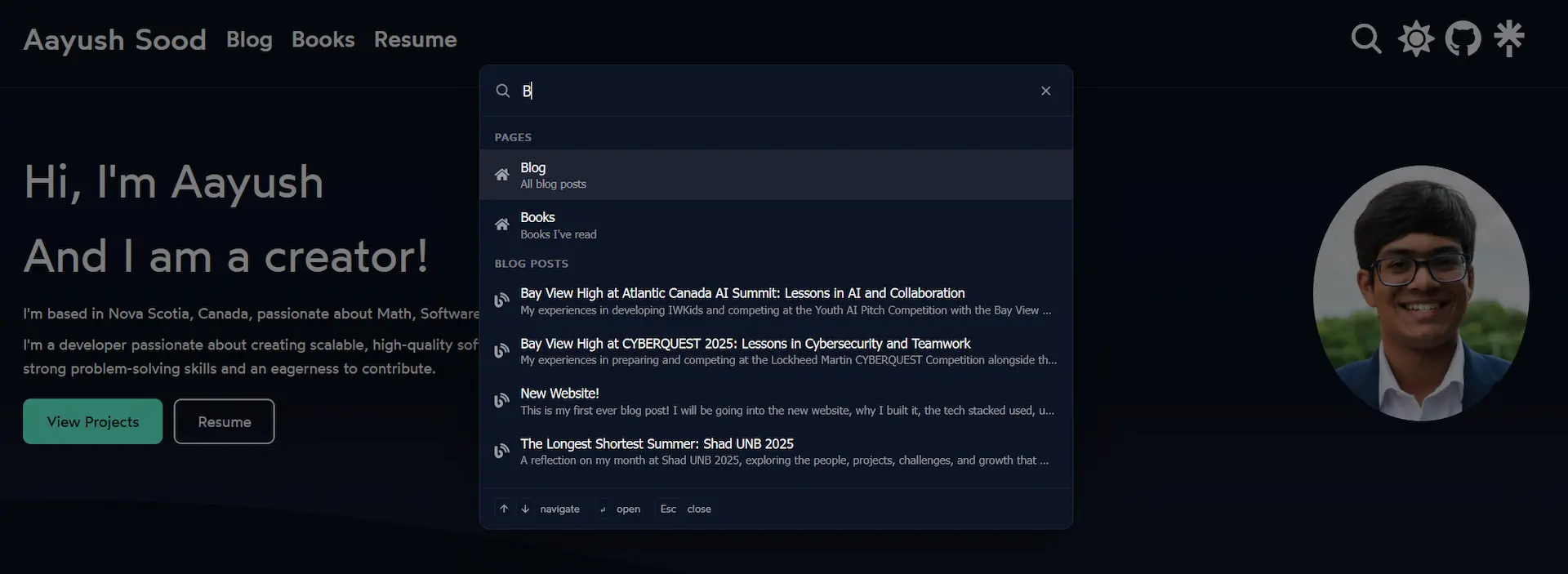
The first big thing I added was a command palette, the kind that opens with Ctrl+K and lets you search the site instantly. If you have used VS Code you know what I mean.
Building it from scratch would have taken me a long time. There were a lot of moving parts: a backdrop overlay, a modal with an input field, grouped search results, keyboard navigation, and a way for the search button in the header to trigger it. Claude Code put together a working version across ten files in one session, which I then refined to only search pages and blog posts since expanding it further caused bugs.
Project Cards and Modals
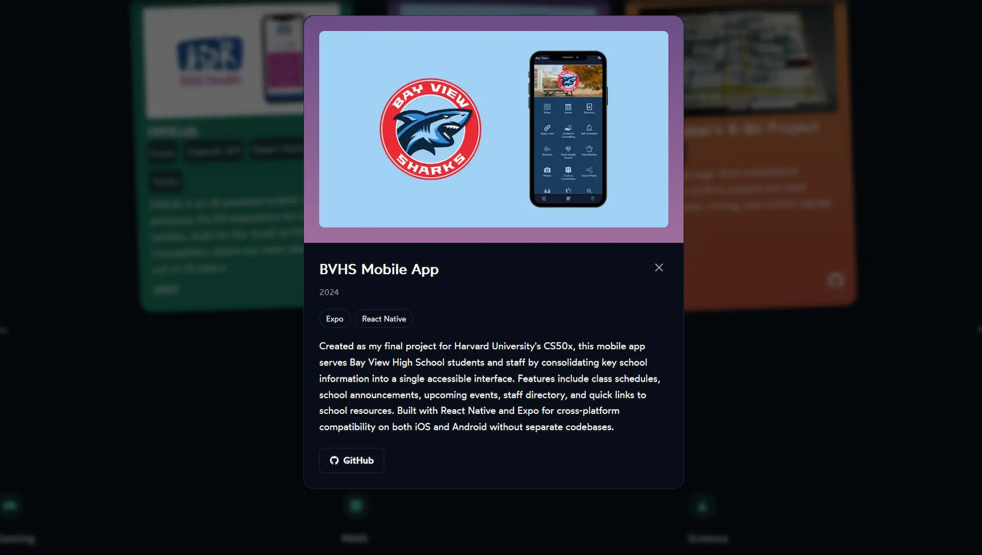
The project cards on my home page used to just show a name, short description, and a link. I wanted a way to read more about each project without leaving the page, so I added modals. Click a card and a panel slides in with the full description, tech stack, year, and links.
This meant creating a new projectModal.js component with its own CSS module. The open and close animation uses Framer Motion's AnimatePresence with a fade-and-scale effect.
Technical Skills Overhaul
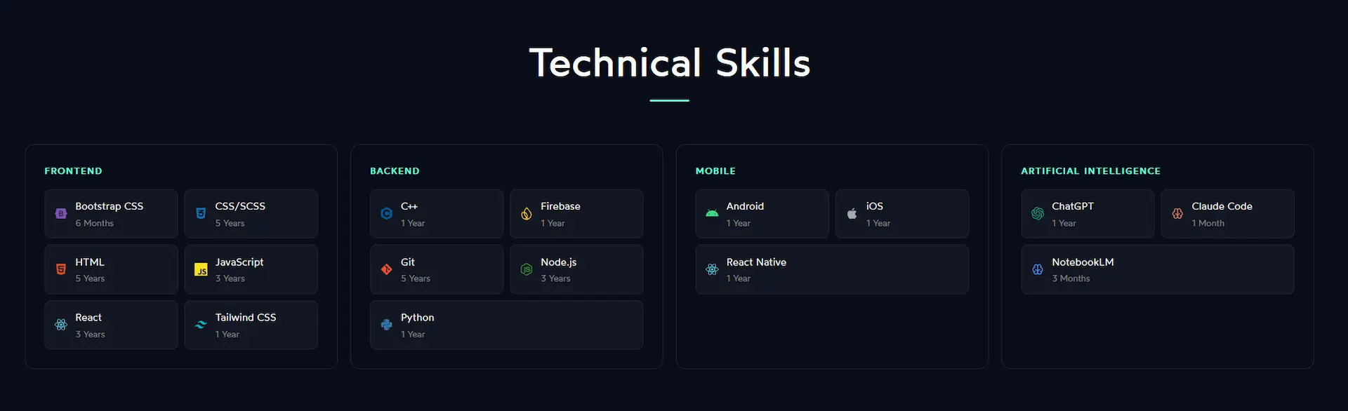
The technical skills section changed the most visually. It went from a plain text list to having brand icons for each technology, a two-column pill grid inside each category card, and a new Artificial Intelligence category with ChatGPT, Claude Code, and NotebookLM.
Getting the layout to work across different screen sizes took more back and forth than I expected. Between 900px and 1130px, the four-column grid made each card too narrow for the pill layout inside it, which caused horizontal scrolling. The same thing happened between 570px and 615px. Each range needed its own media query to fix.
Interests Section
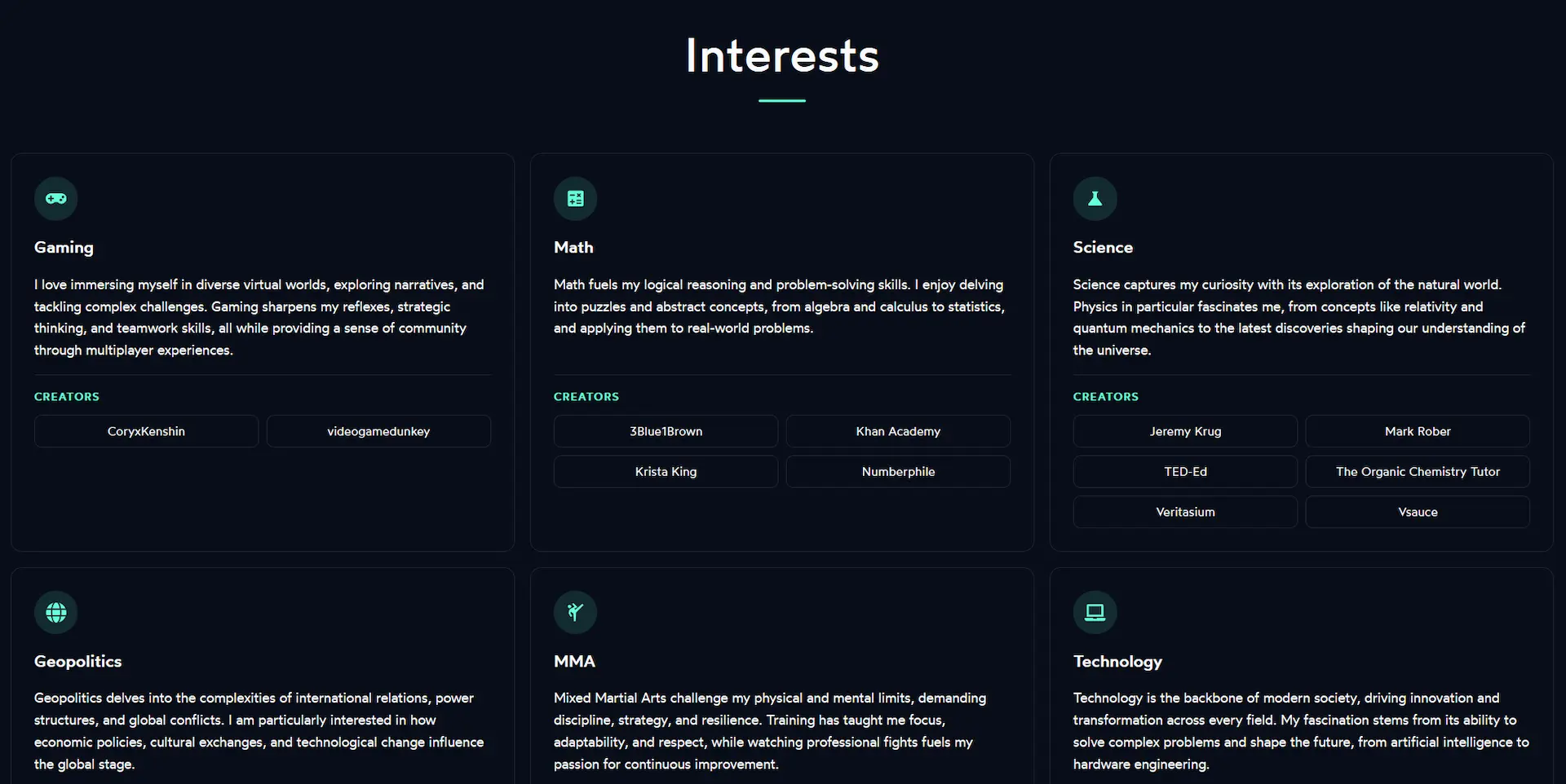
The interests section went through the most changes out of anything on the site. It used to have a "Read More" toggle on each card to hide long descriptions. I removed that and showed all the text at once, which immediately caused a new problem: the card heights were all over the place because the descriptions are different lengths.
I tried fixing it with a ResizeObserver equalization function, which ended up creating an infinite loop. I switched to a window resize listener combined with document.fonts.ready to also handle font-load timing. Eventually I trimmed each description down to two sentences, which made the height differences small enough that the whole thing became much simpler.
Other things I improved in this section:
- Each interest icon now sits in a small accent-colored circle instead of floating above the title
- Cards lift slightly on hover with a Framer Motion animation and the border changes to the accent color
- Creator link pills get a subtle background fill on hover
- The seven-card grid switched from CSS grid to flex with
justify-content: center, so the last card centers on its own instead of sitting in the bottom-left corner - Icons and titles are now left-aligned to match the description text
Blog Table of Contents
The table of contents on blog posts had two scroll bugs that took a few sessions to fully sort out.
The first was that heading IDs were being assigned in the browser after the page loaded, by comparing heading text to the TOC items. This broke silently for any heading with inline formatting like bold or code, because the rendered text did not match the raw markdown. The fix was to inject the IDs server-side in page.js by looping over the TOC items and replacing <h1>, <h2> tags one at a time in order. An earlier attempt using marked.Renderer broke everything because that API is not available in the Next.js edge runtime.
The second issue only showed up on my Shad UNB 2025 post, which has 37 images. If you clicked a section near the bottom while at the top of the page, the scroll calculation happened before the images had loaded, so the target position was way off. Removing loading="lazy" from blog post images fixed it. For a post you are reading top to bottom anyway, lazy loading was causing more problems than it was solving.
Mobile Improvements
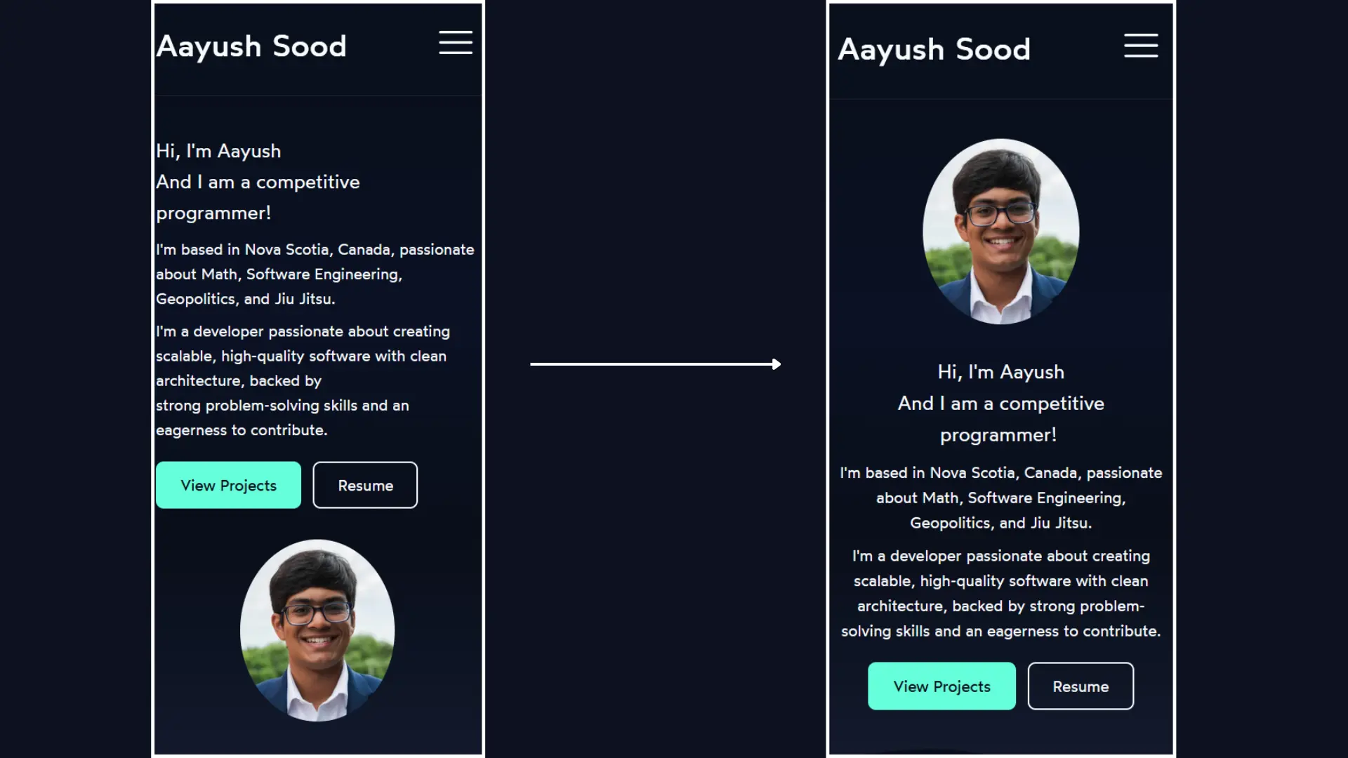
The welcome section on mobile was stacking the text above the photo with everything left-aligned inside a centered container, which looked awkward. I centered all of it, moved the photo to the top using CSS order: -1, and removed a hardcoded <br /> tag that was causing a weird line break at smaller screen sizes.
The resume page also got some mobile fixes: the four contact links now sit in a two-column grid instead of a long vertical stack, list items have more spacing for easier reading, and the base font size went from 14px to 15px.
Metadata and Performance
Some less visible but useful things I also worked on:
- JSON-LD structured data on every page and blog post for better SEO
- Custom Open Graph images per blog post, generated with Satori and Resvg
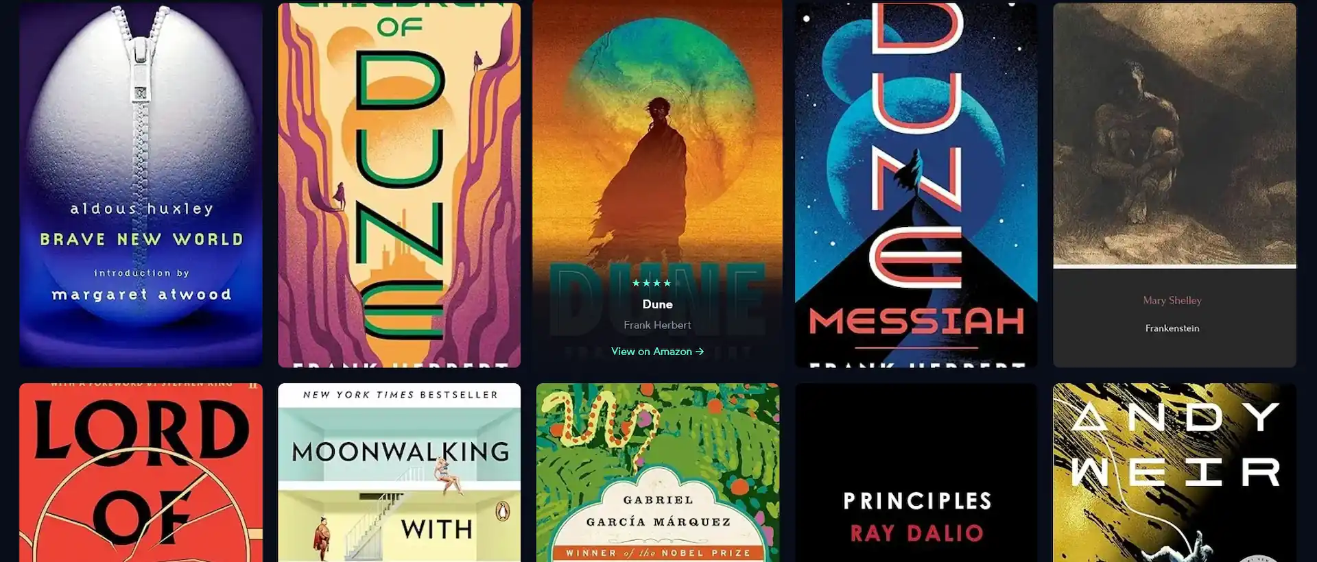
- A star rating system on the books page
- An active-section tracker on the table of contents that highlights the heading you are currently reading
- Timestamps added below blog post titles
Lessons Learned
Describe the problem, not the solution
The best results came when I explained what was wrong and why, not what code to write. Saying "the TOC scroll lands in the wrong place on posts with lots of images" gave Claude Code enough to actually diagnose the problem. Saying "add scroll-margin-top to headings" just produced a patch that did not work and made things worse.
Read every change before accepting it
Claude Code works fast, and that can work against you if you stop paying attention to what is actually changing. One bad change got through early on and broke the table of contents entirely. After that I made a point of reading every file diff before accepting it, no matter how simple it looked.
It works best when you already understand the area
Claude Code was most helpful in areas where I already knew what I was doing. When I understood CSS layout or how a component was supposed to work, I could catch mistakes quickly. When I was less familiar with something, it was harder to tell whether a suggestion was actually correct or just looked reasonable.
Broken things still need real debugging
When something stopped working, just asking Claude Code to fix it was not always enough. The real fix came from actually reading the code, understanding why it broke, and then describing the specific problem. The tool that caused the bug is not always the right tool for figuring out what went wrong.
CLAUDE.md makes a real difference
Claude Code supports a CLAUDE.md file in the root of your project that gets loaded into context at the start of every session. I added one about halfway through and noticed a difference right away.
Before it, I kept having to remind Claude Code of things like the edge runtime limitations, how theming works with CSS variables, and that I should not hardcode colors. After adding the file, all of that was already there. It does not have to be long. Even a short file covering your tech stack, the conventions you follow, and the things that commonly go wrong saves a lot of repeated explaining.
Concerns

It is easy to stop reading your own code
The biggest thing I noticed is how easy it is to just accept changes and move on when things seem to be working. When I did that too often, I started losing track of what was actually in my codebase. I had to slow down a few times and re-read recent changes just to make sure I still understood my own project.
As a student, this is something worth thinking about. If you use an AI tool to fix every bug before you have a chance to figure it out yourself, you get a working website but miss the part where you actually learn something.
Some problems are worth solving yourself
The bugs that Claude Code handles easily are often the same ones that teach you the most when you work through them on your own. Layout issues, scroll calculations, runtime constraints: figuring those out yourself builds understanding in a way that reading an AI-generated fix does not.
For a personal project like this one, I was fine trading some of that for speed. But I think it is worth being deliberate about which problems you hand off and which ones you stick with long enough to actually learn from.
Reflections
![]()
I got more done on my website in these past few weeks than I had in the months before. For a personal project where I just wanted things to look and work better, it was genuinely useful.
That said, it works best as a tool you stay actively involved with, not something you just hand tasks to. The approach that worked for me was to describe problems clearly, read every change before accepting it, test things in the browser, and push back when something broke. It is fast and it knows your project, but you still need to know your project too. The real question isn’t whether tools like this make you faster. It’s whether you’re still learning while they do.